.png?width=820&height=200&name=Compass%20Horizontal%20W%20Mod%20White%20(1).png "Compass Horizontal W Mod White (1)")
CFS Brand Guidelines & Assets
CFS Brand Guidelines & Assets
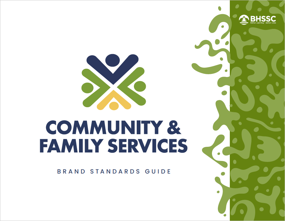
CFS Brand Standards Guide
Get to know the look, feel, and voice of CFS. Our Brand Standards Guide is your go-to resource for using logos, colors, graphics, and language that reflect who we are — and who we serve. Whether you’re creating a flyer, writing a report, or designing a new tool, this guide helps keep everything consistent, professional, and true to our mission.

CFS Logos
Community & Family Services has four variations of our logo: the Primary, the Secondary, the Tertiary and our Icon. Preference should always be given to using the Primary Logo when possible. The Secondary Logo, Tertiary Logo and Icon can be used in instances where the Primary Logo would not be legible.

Brand Colors
Color plays a big role in how we communicate who we are. The CFS color palette is carefully chosen to reflect our values and give our materials a consistent, recognizable look across all platforms.
Our palette is divided into primary and secondary colors. Primary colors form the foundation of our brand and should be used most often. Secondary colors are meant to complement the primaries and add subtle emphasis.
To keep our brand cohesive and professional, use colors consistently and thoughtfully. Secondary colors should support, not compete with, our primary palette.
Primary
Sylvan Lake
CMYK 91, 78, 34, 21
RGB 42, 65, 105
HEX #2a4169
Buffalo Green
CMYK 61, 27, 100, 9
RGB 112, 141, 0
HEX #708d00
Secondary
Cloudy Sky
CMYK 7, 2, 0, 11
RGB 210, 221, 226
HEX: #d2dde2
Rose Quartz
CMYK 0, 85, 57, 20
RGB 205, 30, 89
HEX: #cd1e59
Meadwolark
CMYK 2, 18, 72, 0
RGB 249, 205, 97
HEX: #f9cd61
River Blue
CMYK 71, 25, 0, 36
RGB 47, 121, 162
HEX: #2f79a2
Midnight
CMYK 91, 79, 54, 69
RGB 6, 21, 40
HEX: #061528
White
CMYK 0, 0, 0, 0
RGB 255, 255, 255
HEX #ffffff
Brand Colors
Color plays a big role in how we communicate who we are. The CFS color palette is carefully chosen to reflect our values and give our materials a consistent, recognizable look across all platforms.
Our palette is divided into primary and secondary colors. Primary colors form the foundation of our brand and should be used most often. Secondary colors are meant to complement the primaries and add subtle emphasis.
To keep our brand cohesive and professional, use colors consistently and thoughtfully. Secondary colors should support, not compete with, our primary palette.
Primary
Sylvan Lake
CMYK 91, 78, 34, 21
RGB 42, 65, 105
HEX #2a4169
Buffalo Green
CMYK 61, 27, 100, 9
RGB 112, 141, 0
HEX #708d00
Secondary
Cloudy Sky
CMYK 7, 2, 0, 11
RGB 210, 221, 226
HEX: #d2dde2
Rose Quartz
CMYK 0, 85, 57, 20
RGB 205, 30, 89
HEX: #cd1e59
Meadowlark
CMYK 2, 18, 72, 0
RGB 249, 205, 97
HEX: #f9cd61
River Blue
CMYK 71, 25, 0, 36
RGB 47, 121, 162
HEX: #2f79a2
Midnight
CMYK 91, 79, 54, 69
RGB 6, 21, 40
HEX: #061528
White
CMYK 0, 0, 0, 0
RGB 255, 255, 255
HEX #ffffff
CFS Fonts
Poppins is CFS's brand font.
You can use a mixture of various sizes, weights, and colors of type when creating assets for CFS. Here is one example. However you build your type, remember: there should always be a clear hierarchy in your typography.
Poppins can be downloaded for free at fonts.google.com.

CFS Fonts
Poppins Extra Bold 70
Poppins Semi Bold 55
Poppins Semi Bold 35
Poppins Semi Bold 30
Poppins Semi Bold 120
Poppins Semi Bold 16
Source Sans Pro Regular 25 (Leading 30)
Digital Assets
Use the CFS Digital Assets to keep CFS-branded materials unified, professional, and instantly recognizable.


